Hi everybody! So in this post I am going to discuss a few things about what goes behind an illustration, since many people asked me.
So here is a breakdown of how I usually do the illustration. I’m still learning so please don’t bash me if I go wrong somewhere. These are just suggestions 🙂
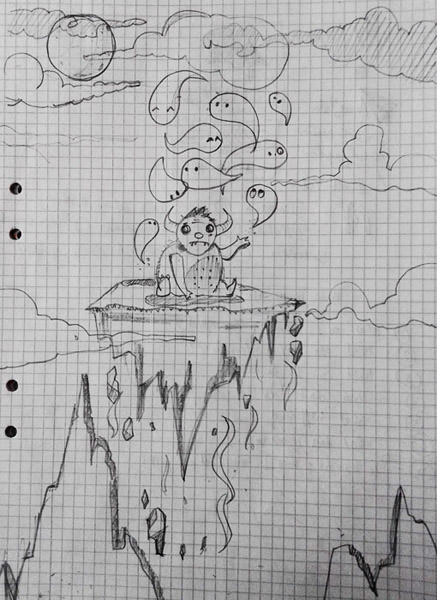
STEP 1: SKETCHING
- So everything starts with a rough sketch in my sketch book like the one below. I always carry a sketchbook or diary with me and I doodle a lot of things in it. So keep a diary around for doodling, trust me it’s a lot of fun.
- The sketch is based on a story line that I want to convey, an idea of some sort or anything.
- Then I decide what type of mood or atmosphere I want to convey. Like the with the Hugo series I wanted it to be a children book style. So a fairytale, fantasy, mystery like ambiance will work.
- Then I decide the characters to be placed in my illustrations. Since kids love adorable, big, fluffy, round figures. I sketched just one like that.
- Now the next big thing to worry about is the color scheme. Color scheme is as important as the illustration itself because ultimately it will convey the emotional mood of the scene you pictured. For example vibrant and contrasting color depicts energy, enthusiasm, happiness whereas a dull color scheme usually depicts blues.

There are a lot of color schemes to choose from but choosing the one that conveys your composition is a tough job.For my illustrations I used a split complementary color harmony. (Read more about color harmonies: http://www.tigercolor.com/color-lab/color-theory/color-harmonies.htm )
- The next thing to check if the perspective is right or not. Perspective adds depth to your drawings so it’s necessary to learn the fundamentals of perspective drawing. In most of my drawing I used one point perspective but you can go 2 point as well (3 point or higher is very rare and make composition looks skewed, uncommon for a normal scenario ).
To add more depth and reality to the scene you can also use atmospheric/Aerial perspective. In Aerial perspective: farther the object the smaller it looks, far objects will look faded and with less details.Like the following image,the white line converge to a vanishing point on the horizon line (one point perspective).The mountains on the other hand look small and the one in the back fades away to convey a sense that they are far away.
- So with all these things in mind you are good to go for a composition that speaks your idea. These points are the backbone of a good composition. I know it’s a lot to do but once you get versed in doing it, it will come naturally.
THE NEXT STEP (SOFTWARE RENDERING):
So in general the most commonly used software for digital paintings and illustration are Photoshop, Illustrator, sketchbook etc.
- For graphic design illustrator is preferred and for digital paintings Photoshop is super flexible. It’s up to personal preference which one you want to use.
- I like to work in adobe illustrator, firstly because of the crisp and sharp shapes that can be drawn in it (for same sharpness in the edge you might need lasso tool in Photoshop).
Secondly because of the vector shapes (if you don’t know about them get to know it).Vectors are the mathematical formulae that illustrator uses whenever you stroke a shape in it. So unlike painting the pixels like in PS and other software, illustrator define a mathematical model for the things you draw in it.Benefit of this is that you can zoom infinitely on an area and the picture will just stay fine (it will not pixelate unlike the other software where photos tend to pixelate if you go beyond a certain ppi (resolution).
- I set my canvas size to A4 paper size, RGB color mode (CYMK if you’re printing), with 300 ppi resolution just in case I want to print my design later. I work on portrait mode with just the pencil and pen tool and a limited color palettes.
- All these restriction of size, tool and color helps me to focus on the composition and the scene rather than to worry about the fancy tools.
For beginning I guess it’s a good way to learn things the hard way, as you get better with practice you can use more sophisticated tools.
Thanks for reading! It was just a quick summary of how I like to work with my illustrations and project. Let me know the suggestion in comment section. I’ll add more detailed stuff related to the software and sketches later.
Stay tuned! Like share and follow my blog. Happy blogging 🙂

good job
LikeLike
Thanks nutan 🙂 glad you liked it.
LikeLike